Google Trends: A Digital Marketing Resource and Internet Curiosities Cabinet
The meaning of dreams, seasonal recipes, what a data set sounds like, and what makes us similar despite language differences – what do they all have in common?
For most marketers, Google Trends is a strictly utilitarian tool: you open it, check if a keyword is growing, close it. But did you know that the platform has much more to offer? Not many professional tools also offer you an oasis of beauty and creativity, where you can take refuge when you need to let your mind defocus for a moment from professional tasks and take a welcome rest. Google Trends is one such resource.
Basically, Trends has two parallel sides: one is the professional one, as a free tool for researching the level of demand in the online market for certain terms, used daily by marketers for editorial planning, SEO, and paid campaigns. The other is the artistic one: a real bazaar where designers and journalists transform billions of searches into maps of dreams, rhythms of food and even music. A cabinet of curiosities that is waiting, obediently, for you to explore it and make your day better.
We’ll talk about both sides in this article. The first part is a practical guide to using Google Trends in digital marketing. The second part is an incursion into the data visualization section of the platform — the place where search data becomes visual stories.
What is Google Trends?
Google Trends is a free service provided by Google that shows the relative search interest for a term over time and by geographic region. The data covers the period from 2004 to the present, with options for real-time (last 7 days) or historical analysis.
Three clarifications that are good to know:
- The values are not search volumes. The 0–100 scale is normalized: 100 means the peak of interest in the selected period and area, not a number of searches.
- The data is sampled. Google uses a sample of all searches, which means small variations between identical queries.
- Terms with very low volume appear as 0. The absence of data does not mean the absence of demand, but demand below the reporting threshold.
Main Features, in Brief
| Feature | What You Get with It | Usefulness in Marketing |
| Explore | Basic query, with filters | The starting point for any analysis |
| Interest over time | Evolution of interest over time | Seasonality, trends, decline |
| Interest by region | Geographical distribution (country, county, city) | Local targeting, prioritizing markets |
| Related queries | Related searches, in Top and Rising format | Content ideas, long-tail keywords |
| Related topics | Related topics (entities, not strings) | Understanding semantic context |
| Compare | Up to 5 terms simultaneously | Competitive analysis, choosing between variants |
| Trending Now | Accelerated growth searches, in real time | Newsjacking, opportunity content |
| Year in Search | Annual search retrospective | Reports, “year in review” content |
The available filters — period, country/region, category, and search type (Web, Images, News, Google Shopping, YouTube) — are what transforms a generic graph into a usable insight. A search on YouTube Search behaves completely differently than one on Web Search, and the category filter eliminates ambiguities.
Another important distinction is between terms vs. topics. When you type a word in the search bar, Google offers you both the search term (text match) and topic (Knowledge Graph entity) options. Topics aggregate all linguistic and spelling variations of the same notion. For serious analysis, topics are almost always the right choice.
Google Trends in Digital Marketing
Organic Content Marketing Planning
The most valuable use of the Google Trends platform in content marketing is not the discovery of keywords, but their validation and calendar planning.
Editorial Calendar Based on Seasonality
Classic keyword research tools give you a monthly average of search volume. This average hides exactly the information you need: when demand is coming in. A term with 3,000 monthly searches may actually have 30,000 searches in November and almost zero the rest of the year.
Recommended process:
- Select a 5-year time frame to distinguish a true seasonal pattern from a one-time anomaly.
- Identify the peak month of interest.
- Publish content 6–10 weeks before the peak, to allow time for indexing and authority to build.
- Schedule content updates 3–4 weeks before the peak next year.
Differentiating Trends from Ephemeral Patterns
Before investing in a content marketing pillar, check the shape of the long-term search curve and make decisions accordingly. Thus:
- Sustained growth over 3–5 years → safe investment in evergreen content.
- Steep peak followed by a crash → bland topic; only worth quick and cheap content.
- Plateau with recurring seasonal peaks → ideal candidate for annually updated content.
- Steady decline → signal of devaluation; stop allocating resources to it.
Related Queries as a Source of Briefs
The Rising section is the most underused area of the platform. It lists the searches with the highest percentage increase in the selected period, and the “Breakout” label marks terms with an increase of over 5,000%. These are questions that the audience is asking now and for which, as a rule, there is no optimized content yet. It is the fastest path to an article that positions itself without competition.
Geographic Optimization
The Interest by region section shows you where demand is concentrated. For a Romanian business with a local presence or for an online store with regional delivery, this map justifies prioritizing location pages and adapting the message.
Paid Campaigns (PPC and Social Media Ads)
In the area of media buying, Google Trends intervenes at three distinct moments of a campaign.
Before Launch — Budget Allocation Over Time
Evenly distributing the budget over 12 months is a common mistake. Overlaying the interest curve over the media plan shows you the areas where focusing your investment produces maximum return and where you pay for impressions in a market that is not searching.
During the Campaign — Tactical Adjustments
Comparing your own brand to that of your competitors signals changes in awareness. A sudden increase in interest in a competitor may justify intensifying bidding on the competitor’s brand keywords or, conversely, a defensive campaign.
For Optimizing Keyword Lists
Rising terms become candidates for new ad groups, with low competition and low cost per click. Conversely, terms in rapid decline are candidates for pausing or negative keyword lists.
Practical Applications of Google Trends for Your Marketing Objective
| Objective | What To Check in Google Trends | Resulting Decision |
| Product Launch | 5-year seasonality + regional interest | Launch date and priority markets |
| Editorial Calendar | Monthly peaks for pillar topics | Publish and refresh dates |
| Choosing a Campaign Name | Comparison between 2–5 variants | The wording with the highest resonance |
| Newsjacking | Trending Now, filtered by Romania (or area of interest) | Responsive content topics |
| International Expansion | Interest by region at global level | Order of entry markets |
| PPC Optimization | Rising queries + declining terms | New and negative keywords |
| Video Strategy | YouTube Search filter | Channel formats and topics |
Limitations to Keep in Mind
Methodological honesty makes the difference between a useful analysis and a misleading one. Keep in mind that on Google Trends:
- You don’t get absolute volumes. For traffic estimates, you need Keyword Planner or third-party tools.
- Niche terms are invisible. In small markets like Romania, many specialized B2B keywords don’t generate enough data, and big terms are “fluff”, irrelevant.
- Correlation does not imply causation. A spike in interest can come from a news story, a meme, or a linguistic coincidence, not from commercial intent.
- Comparisons are relative to each other. If you add a term with huge volume, the other four visually flatten out, even if their evolution remains significant.
Rule: Google Trends answers the questions “when”, “where” and “in which direction”, not the question “how much”.
The Cabinet of Curiosities
Beyond the functional interface, Google maintains a hub dedicated to visualization projects built on search data. It’s where the Google Trends team collaborates with some of the best data visualization designers in the world. Here, data stops being a working tool and becomes storytelling material, easy to digest between two work sessions, even for those who aren’t fond of numbers.
Visualizing Google Trends Data
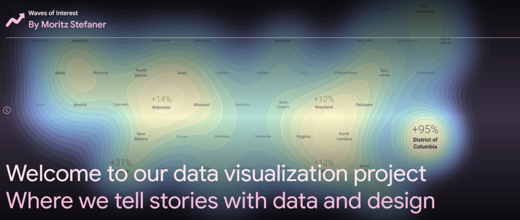
The Visualizing Google Trends Data page is a curated gallery organized by category: visual essays by authors like Nadieh Bremer, Moritz Stefaner, Federica Fragapane, and Xaquín G.V.; interactive explorations; quizzes; and free tools you can use with your own data.
Here are some of the projects currently hosted here:
- Waves of Interest — the US election cycles read through waves of search (Moritz Stefaner)
- Searching for Birds — what Americans search for about the birds around them (Nadieh Bremer)
- Frightgeist — the annual Halloween costume explorer
- The New Normal — life after COVID, read through search data
- Datagifmaker — a free tool for generating animated GIFs with data.
- Trends TV — a screensaver that displays global trends in real time, in maps and graphs.
For a marketer, the visualization hub in Google Trends is a source of inspiration for content formats and a demonstration of what data storytelling is really, really well done.
Here’s what a GIF we made with Datagifmaker looks like:
Next, we’ll briefly introduce some of the most attractive data visualization projects in Google Trends.
TwoTone — Sonification: Turn Your Data Into Music
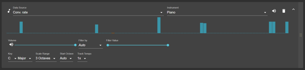
TwoTone is a free, open-source web application that does something amazing: it turns a data set into music without you having to write a single line of code. It’s a project developed by Sonify (originally Datavized Technologies), with support from the Google News Initiative.
The technique is called data sonification, and it’s the auditory equivalent of visualization: instead of mapping values onto axes and colors, you map them onto pitch, tempo, and instruments. The result is an extra dimension of perception. The human ear detects rhythmic patterns and anomalies that the eye can miss, especially in long time series.
How it works:
- Upload a CSV/XLS/ODS file or use one of the included datasets.
- Assign each column a “track” — an instrument, a scale, and a range of notes.
- Adjust the tempo and key.
- Listen to the result and export it as an audio file.
Why does it matter to marketers?
A seasonality chart exported from Google Trends and converted into an audio track can make a great social media content, podcast episode, or presentation opener. It’s also an accessibility tool for visually impaired audiences.
The Shape of Dreams — How the World Searches for the Meaning of Dreams

The Shape of Dreams is a project by Italian designer Federica Fragapane, with implementation by Paolo Corti, under the artistic direction of Alberto Cairo and coordinated by Simon Rogers, created for Google Trends and Google News Lab.
The starting point: by entering incomplete questions into Google Trends, such as “what does it mean to dream about…”, the related queries section automatically returns a list of topics that people actually dream about and search for. The author repeated the exercise in several languages, for about a year.
The central discovery was that there are universal dreams and local dreams. Some topics appear constantly, regardless of language — teeth falling out, snakes, flying. Others are specific to a culture and disappear completely in other linguistic spaces.
The result is an interactive storytelling experience, in which each dream is given an organic form — petals, floral structures, animated illustrations with a wind effect. It is one of the few dataviz projects in which aesthetics do not decorate the data, but translate it.
The lesson for marketing: The incomplete question technique introduced in Google Trends is transferable to our work. Type “how to…”, “why…” or “best…” followed by your niche and let related queries build your editorial brief.
Beautiful in English — What People Translate into English
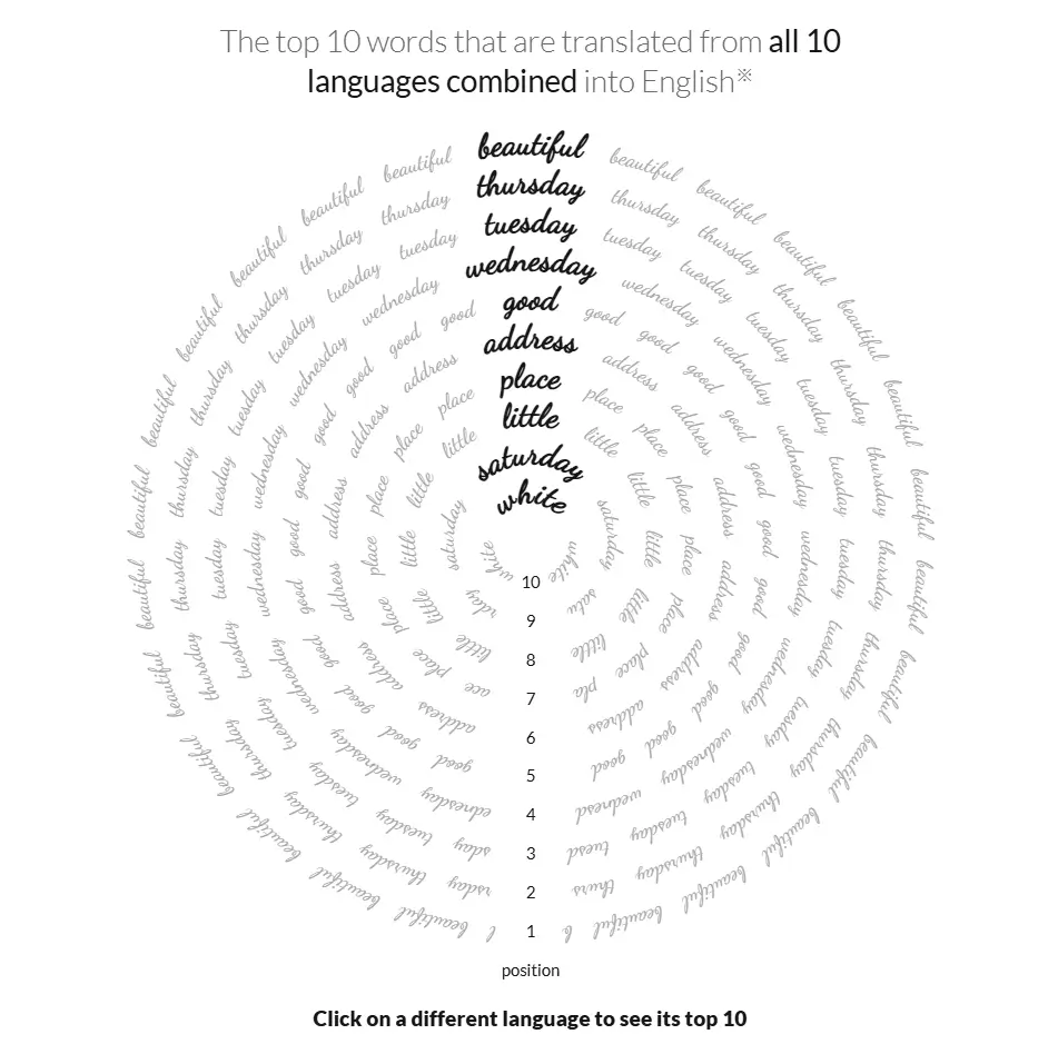
Beautiful in English is a project by Nadieh Bremer (Visual Cinnamon) in collaboration with Google News Lab, which starts from a cultural anthropology question: what does the translation behavior of a language tell us about the culture that speaks it?
The analysis covers single-word translations — nouns and adjectives — made by Google Translate from 10 of the most popular languages into English, between August and December 2016.
Memorable results:
| Source Language | Most Translated Word | English Translation |
| German | schön | beautiful |
| Turkish | güzel | beautiful |
| Spanish | bonito | beautiful |
| Russian | мама | mama |
| French | bon | good |
| Italian | buono | good |
| Portuguese | boa | good |
| Dutch | collega | colleague |
| Polish | czwartek | thursday |
| Japanese | 作業 | work |
A few observations:
- The most translated word overall, across all languages, is beautiful.
- The overall tone is positive: love, great, and happy all rank highly.
- The days of the week are surprisingly popular, especially in Spanish, Italian, and Polish.
- Dutch is a curiosity: collegae and colleague are almost identical — they only differ by two vowels.
- Japanese is the most isolated: no words in the Japanese top 10 appear in the overall list.
- The project includes a similarity network between languages: Spanish shares four words with Portuguese and Italian, and Russian is closest to Polish.
This project combines data from Google Translate with search interest from Google Trends for the resulting words. It’s a great example of triangulating sources — a practice you can apply by combining Trends with your Search Console or CRM data.
The Rhythm of Food — The Annual Food Clock
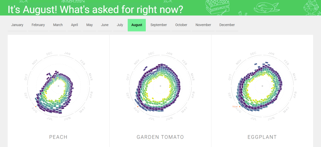
The Rhythm of Food project is the result of a collaboration between Google News Lab and Moritz Stefaner’s Truth & Beauty studio, with development by Yuri Vishnevsky and illustrations by Stefanie Weigele. It’s probably the most relevant project in the entire gallery for a marketer.
The team collected weekly data from Google Trends for hundreds of recipes and ingredients, over a period of 15 years, and plotted it on a “year clock” — a radial chart in which the year is a circle, and each successive year adds a ring. The structure of the site includes 195 topics and 129,660 data points, based on search interest in the United States.
The choice of circular representation comes from the fact that seasonality is cyclical, and a linear chart artificially breaks it on December 31. On a yearly clock, the peak of searches for apricots, for example, appears as a concentrated arc, and the migration of a trend from one season to the next becomes visible at a glance.
The project distinguishes several recurring patterns:
- Seasonality — ingredients related to the harvest period.
- Holiday peaks — dishes concentrated on a few days a year.
- Rising trends — foods that gain constant interest, year after year.
- Falling trends — dishes that are falling out of fashion.
Two methodological details are worth adopting in your own practice: the team used Knowledge Graph topics instead of simple keywords to avoid ambiguities (apple fruit vs. Apple company), and worked with weekly, not monthly, data to capture peaks over a few days.
What a Marketer Can Learn From These Creative Data Visualization Projects Using Google Trends
| Project | Transferable Technique |
| The Shape of Dreams | Incomplete questions in Trends to automatically generate content ideas |
| Beautiful in English | Combining two data sources for insight that neither provides alone |
| The Rhythm of Food | Long-term analysis (10–15 years) + weekly data + topics, not keywords |
| TwoTone | Alternative data presentation formats, including for accessibility |
| Hub-ul oficial | Library of narrative formats for reports and brand content |
The common denominator of all these projects: search data is a testament to what people want to know when no one is looking. It’s among the most honest sets of behavioral data publicly available online — and, (perhaps not) coincidentally, it’s free.
Conclusion
Google Trends deserves to be treated for what it is: not a keyword research tool, but a tool that takes the pulse of collective curiosity. In digital marketing practice, it tells you when to publish, where to invest, and where your audience’s attention is moving. In its gallery of visualizations, it shows you what happens when someone has the patience to listen to the same data until it starts to tell a story.
Both uses start with the same discipline: ask a specific question, choose the right interval, filter out the noise, and look at the shape before looking at the numbers. The rest — whether it’s an editorial calendar or a food clock — flows from there.
Do you want to learn how to use analytics tools correctly in your work? Discover the Digital Marketing course from NewTech Academy and turn your data into decisions.
Frequently Asked Questions about Google Trends
Yes, completely free and without a mandatory account. Logging in with a Google account only adds saving options and alerts.
No. It shows relative interest, on a normalized scale of 0–100, where 100 marks the peak in the selected period and region.
It marks a term whose search frequency has increased by more than 5,000% compared to the previous period — usually a term that was almost non-existent before.
Search term matches exact text. Topic is an entity in the Knowledge Graph and aggregates all linguistic and spelling variants of the same notion. For comparative analysis, topic is more reliable.
Yes, in CSV format for each module, and graphs can be embedded into web pages via embed code.
For seasonality, a minimum of 5 years. For assessing a long-term trend, 10 years or “2004 – present”. For newsjacking, the last 7 days or the last 24 hours.
Yes, with one caveat: niche and specialized B2B terms may fall below the reporting threshold. For these, use broader categories or topics instead of exact keywords.
Articol publicat de Laura Bojincă-Moisei
Specialist în Digital Marketing cu un background în Jurnalism și Psihologie, completate de certificări PPC și Social Media, Laura crede că cele mai bune campanii sunt cele care construiesc o conexiune umană autentică. Cu peste 10 ani de experiență în marketing și pasionată (până la „nerdiness”) de tehnologie, Laura rămâne un om al cuvintelor cu un apetit constant pentru a învăța lucruri noi.